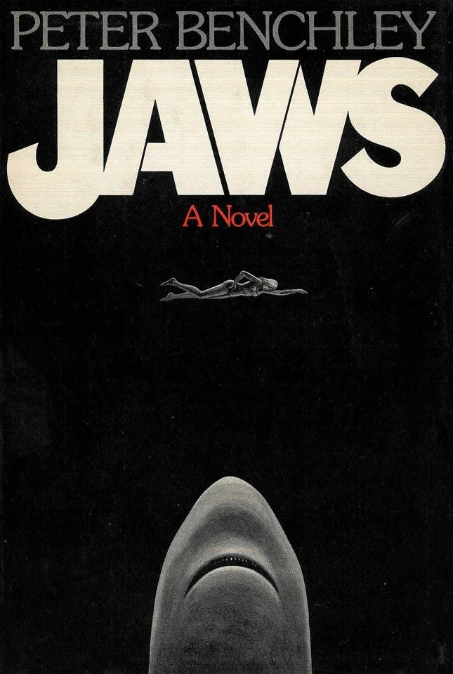
The REAL story behind the creation of the iconic JAWS book cover
A single image that etched itself into the collective consciousness of a generation: a woman leisurely swimming on the surface, oblivious to the immense great white shark lurking just beneath her.
The iconic covers of Peter Benchley’s "Jaws" left an indelible mark, seamlessly transitioning from the book to the film adaptation by Steven Spielberg, becoming synonymous with the story. As we commemorate the 50th anniversary of Benchley's breakthrough novel let's reflect on the genesis of these unforgettable covers.
Jaws - U.S. Hardcover Final Jacket - 1974
In 1974, amidst the resounding success of Benchley's novel, The New York Times Magazine featured a captivating exposé by Ted Morgan, offering a glimpse into the arduous journey of bringing the book to print.
Wendell Minor’s orginal illustration “to show a peaceful unsuspecting town through the bleached jaws of a shark.”
Morgan's piece delved into the creation of the book's cover, spearheaded by art director Alex Gotfryd, described as a sophisticated figure with a distinctive Polish cavalry mustache, prolifically producing 700 covers annually. Initially, Gotfryd enlisted Wendell Minor to bring Benchley's vision to life: a serene coastal town contrasted against the ominous jaws of a shark.
Tom Simmonds’ ventual first UK edition of JAWS
Excerpt from ‘...and then, and then, and them.. The making of a best seller’
“Jaws” was ready for publication in mid‐January 1974, but a small crisis over the jacket caused a two‐week delay. When the salesmen had vetoed the first jacket, Congdon had gone back to Alex Gotfryd and said: “We'ire got a problem. Can we have just a fish on the cover?” “The cover's not big enough,” Gotfryd said. “It will look like a sardine.” Finally they decided to go with a typographical jacket, the title and the author in stark lettering against a black background. They printed 30,000 copies and jacketed the books—an operation that is still done by hand — in Doubleday's Berryville, Va., printing plant.
When Oscar Dystel of Bantam saw the jacket, he was unhappy. “Without an image,” he said, “no one would know what ‘Jaws’ meant. It could have been a book about dentistry.” He asked Congdon to put a shark on, the jacket. Congdon went to see Gotfryd and said: “Dystel wants, an illus. tration. He's advanced a lot of money. I think we should honor his request.” Gotfryd stifled his exasperation and called artist Paul Bacon, who Made a rough layout of the enormous head of a fish. “Why can't we have a swimmer as well to have a sense of disaster and a sense of scale?” Gotfryd asked. Bacon came in the next morning with the completed jacket, an open‐jawed shark's head, rising toward a swimming woman. Dystel was pleased and Wrote Congdon on Dec. 20: “The jacket design for ‘Jaws’ is much improved. If you sell 100,000 copies we'll follow you to the letter.” “We realized that the new version looked like a penis with teeth,” Congdon said, “but was that bad? I placated Alex by buying him a $17 necktie at Paul Stuart.”
As JAWS has been republished throughout the decades, a mixture of Kastel’s classic depiction and modern twists have been used to capture the attention and imagination of readers, new and seasoned alike.
Jaws - U.S. Paperback - 1975
Jaws - UK Hardcover
JAWS published by Pan GB 1976 (illustrator unknown)
Jaws - Australian Paperback - 1976
Jaws - U.S. Paperback - 1991 (Fawcett Crest publications)
Ballantine Books Trade paperback edition (2013)
JAWS novel cover illustration by Roger Kastel published by Pan (2012)
Peter Benchley's Jaws designed by Tom Lenartowicz for Penguin Horror (2016)
Words by Ross Williams
If you would like to write for The Daily Jaws, please visit our ‘work with us’ page
For all the latest Jaws, shark and shark movie news, follow The Daily Jaws on Instagram, Twitter and Facebook.


